
Typography
Fonts are a key part of how we express our brand. This section shows how to use our fonts effectively, with practical examples to help you create clear, recognisably Experian communications.
Fonts are a key part of how we express our brand. This section shows how to use our fonts effectively, with practical examples to help you create clear, recognisably Experian communications.
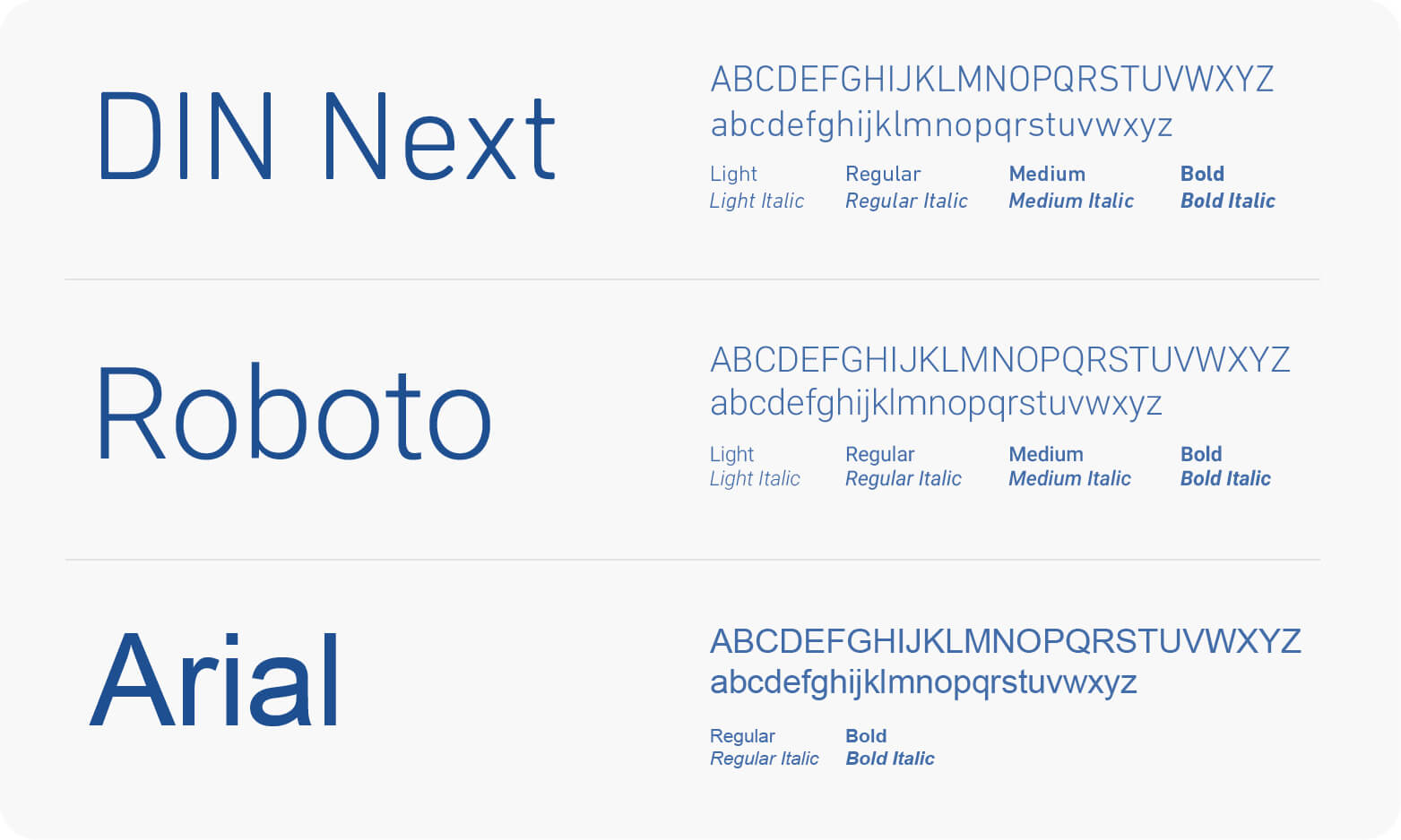
We have defined three fonts for use in Experian materials, as no single font works perfectly for all media.
DIN Next: Our primary brand typeface for print and digital content. DIN Next is a licensed font for use by design professionals only. Supporting agencies must purchase the font.
Roboto: Our font for web pages and other online applications where a font needs to be loaded. Roboto is a free Google font.
Arial: Our system typeface, used for Microsoft Office applications, such as PowerPoint or Word.
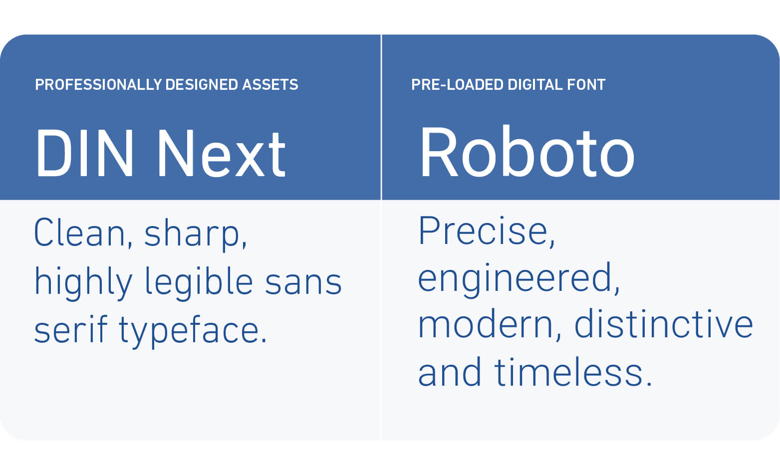
DIN Next and Roboto were selected as they share similar characteristics and blend aesthetics and practicality. This helps us maintain a consistent look online and offline.
We use DIN Next for all our professionally designed communications. This includes online content that does not require an embedded font like banners, social media posts, display ads and videos.
We use Roboto online when a font is required to be loaded such as our websites, products or apps.
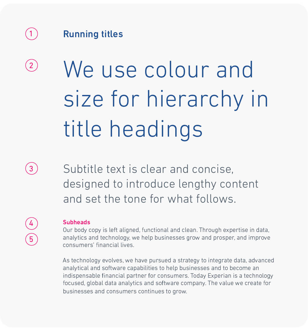
We use text size, weight and colour to establish visual hierarchy, applying the same principles to both DIN Next and Roboto. Here's an example:
Short versions of the main title at the top of each page, no larger than subtitle text if required
The largest text in a layout, designed to lead the eye, roughly double the size of the subtitle. Medium is suitable for smaller headings in digital applications.
Read second, roughly double the size of body copy.
Read before body copy, set the same size as body copy.
Read last, coloured Experian Grey, set in Light or Regular.
Italics can be used sparingly to highlight specific words or quotes.
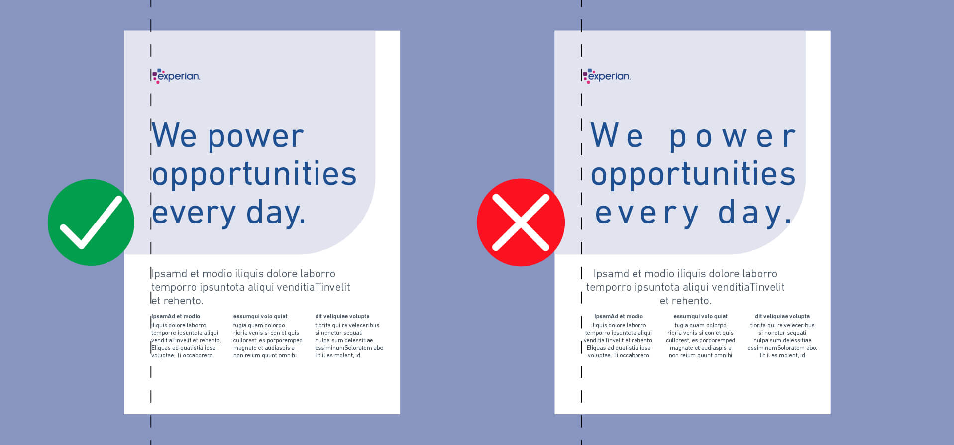
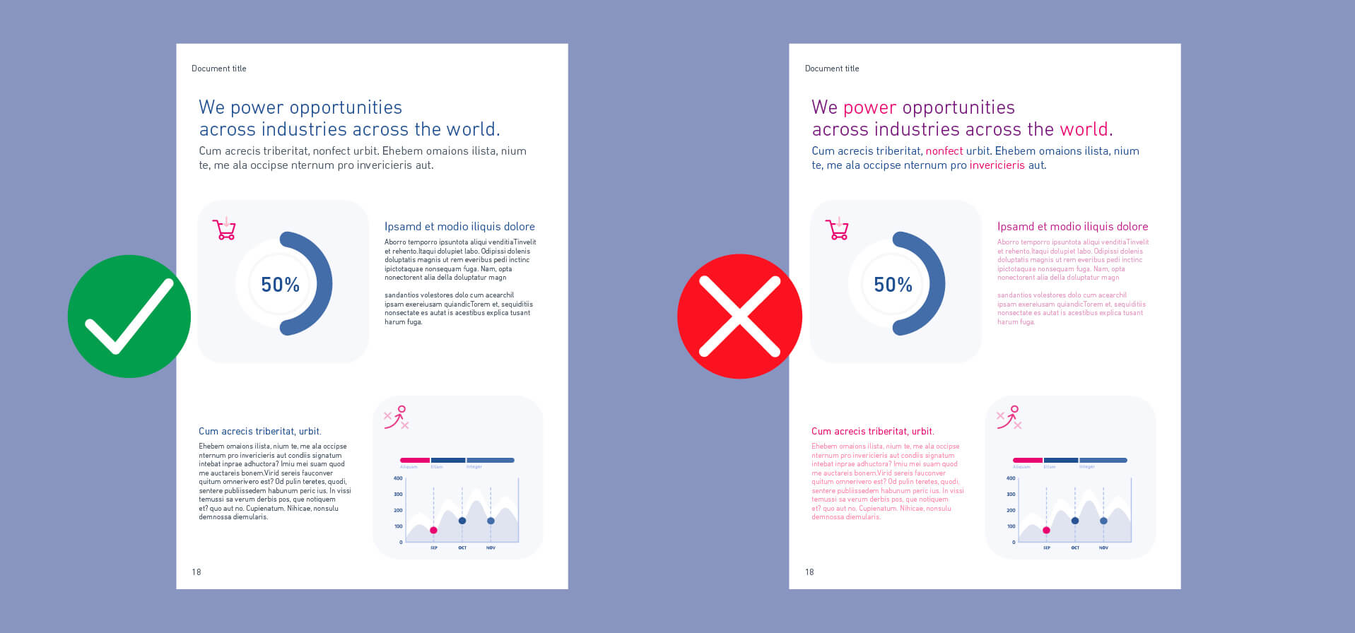
Here are some common typographic mistakes to avoid.