
Photography
Photography helps bring our brand to life. It should feel consistent across all touchpoints and regions, supporting our style and message. Use these principles to choose and apply images that reflect who we are
Photography helps bring our brand to life. It should feel consistent across all touchpoints and regions, supporting our style and message. Use these principles to choose and apply images that reflect who we are

We use photography to bring our purpose to life and help tell our diverse brand story. We focus on genuine, relatable, people-centric imagery to create an emotional connection with our audiences.

Images should look natural and unfiltered, never staged or over edited. We focus on candid shots of people living in the moment. Our photos capture a bright and optimistic outlook, showcasing the opportunities that lie ahead.

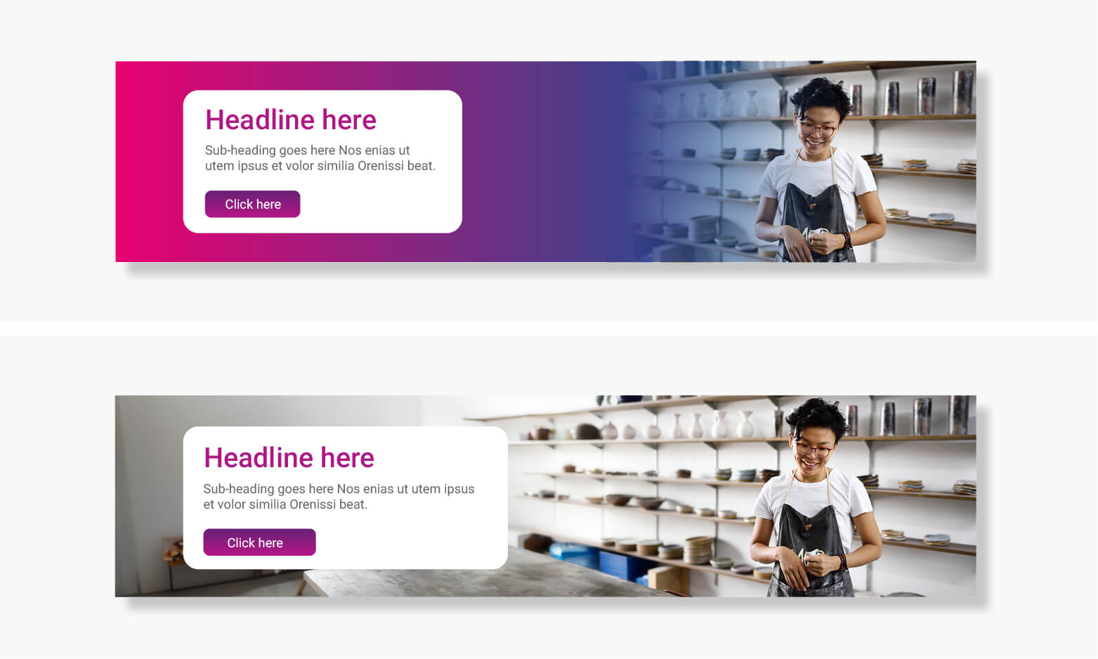
When using imagery as the main face of the brand, such as on the cover of a PowerPoint presentation, report cover, or website header, select images that allow space for content. Opt for images with cleaner backgrounds that can accommodate text directly on the image. If the image does not allow for this, consider using a squircle or rounded corner rectangle to improve readability.
To add more visual interest in compositions or to create more space for content position subjects off-center, this also helps to visually balance designs.
Make sure the focal point of the image has enough breathing space and the design elements don’t overcrowd it.

Custom-made just for us and can’t be found anywhere else. Help your content stand out with exclusive visuals. See Custom Content folder on Brand Asset Hub.

Ensure images represent a diverse range of people, different ages, genders, ethnicities, and abilities to foster inclusivity and mirror our global community.

Consider using a stock image library if you can’t find an image on the Brand Asset Hub, but make sure the images are royalty-free or licensed before use.
Custom-made just for us and can’t be found anywhere else. Help your content stand out with exclusive visuals. See Custom Content folder on Brand Asset Hub.
Ensure images represent a diverse range of people, different ages, genders, ethnicities, and abilities to foster inclusivity and mirror our global community.
Consider using a stock image library if you can’t find an image on the Brand Asset Hub, but make sure the images are royalty-free or licensed before use.

Portrait shots connect with our audience personally by featuring real people in natural settings, telling diverse stories that resonate with our brand. Use these in client case studies or leadership messages on Horizon.
Capture lifestyle portraits with subjects looking at or near the camera, positioned centrally or off-center to create more visual interest. Enhance storytelling by photographing subjects in their natural environment.
Alternatively, people within photography can be shot in a studio, or digitally cutout and placed on a brand coloured background.
Follow our photography style to capture optimism and authenticity. Subjects should appear natural and relaxed, not overly posed. Consider shooting landscape to allow space for content in layouts.

When it comes to choosing and using images, it’s important to avoid common mistakes to keep our brand image consistent.
Here are some examples.
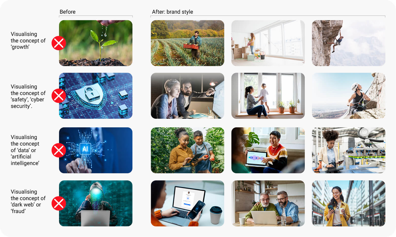
Visual metaphors are often used to explain ideas quickly. We like to avoid them as they can seem overused and unoriginal. Instead, we believe that using subtle imagery can be much more effective in capturing interest and engaging viewers.
The images shown here illustrate the basic idea of replacing overly literal images with ones in our brand style.
When choosing images to represent a negative subject, opt for ones that convey a sense of resilience or positivity. The headlines or text that go alongside these images also help to convey the intended message.
Is your image too small to fit the frame? As an alternative to using a gradient overlay to fill the space, try extending the photo first using Photoshop’s Generative Fill tool. If you need to overlay content, consider using a gradual blur instead. This technique helps to focus the eye and maintains a natural, modern look for the image.
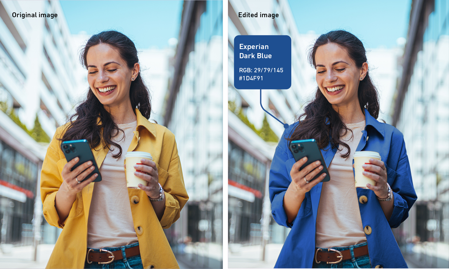
As an optional enhancement, you can elevate the uniqueness of your lead image by incorporating a Primary brand colour. Achieved by subtly integrating the colour into the focal point of the photograph, such as through an item of clothing or focal object. While exact colour matching may not always be possible due to lighting variations, aim for as close a match as possible to maintain brand consistency and visual appeal.