Squircles
Squircles are a distinctive and ownable part of our brand’s look and feel. This section details the different types and how best to utilise them in your designs to keep everything consistent and recognisably Experian.
Squircles are a distinctive and ownable part of our brand’s look and feel. This section details the different types and how best to utilise them in your designs to keep everything consistent and recognisably Experian.
Visit our Brand Asset Hub to access a range of squircle assets.
Brand Asset Hub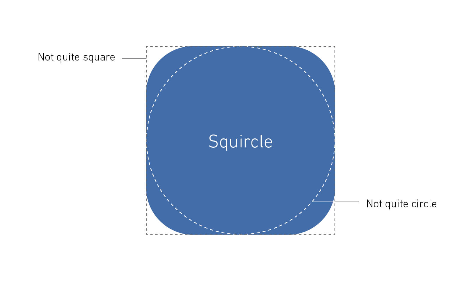
Squircles are those “not quite a square, not quite a circle” tiles that radiate from our brand mark.
This versatile shape can be used in a variety of ways, from framing content to creating distinctive brand visuals.
In this section, you can find details on the two types of squircles and how best to implement them.
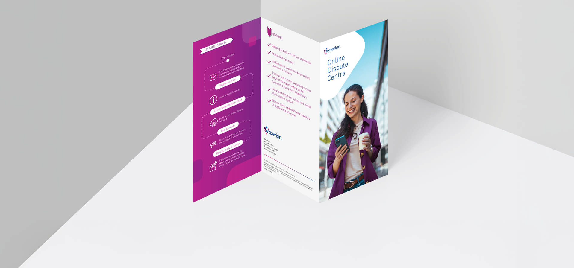
We use the 2D graphic device to organise content. It can be used as a shape to contain information, frame photography, or simply to add interest in layouts.
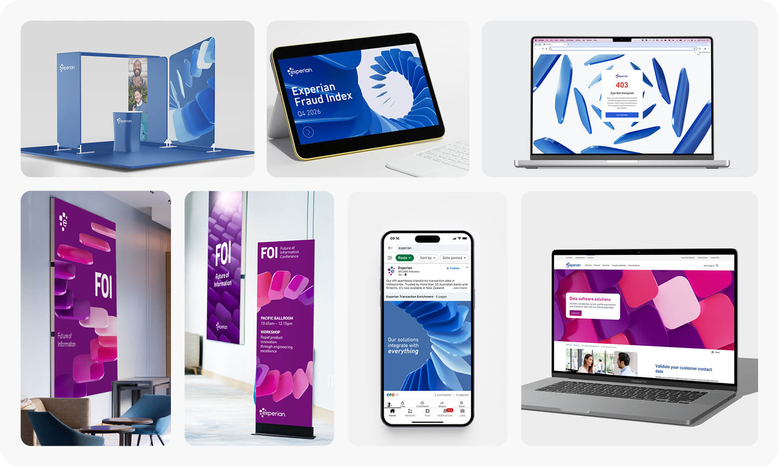
We use 3D squircle renders as a distinctive brand expression asset, symbolising the flow of data. These are used in place of photography when representing the Experian brand more broadly.
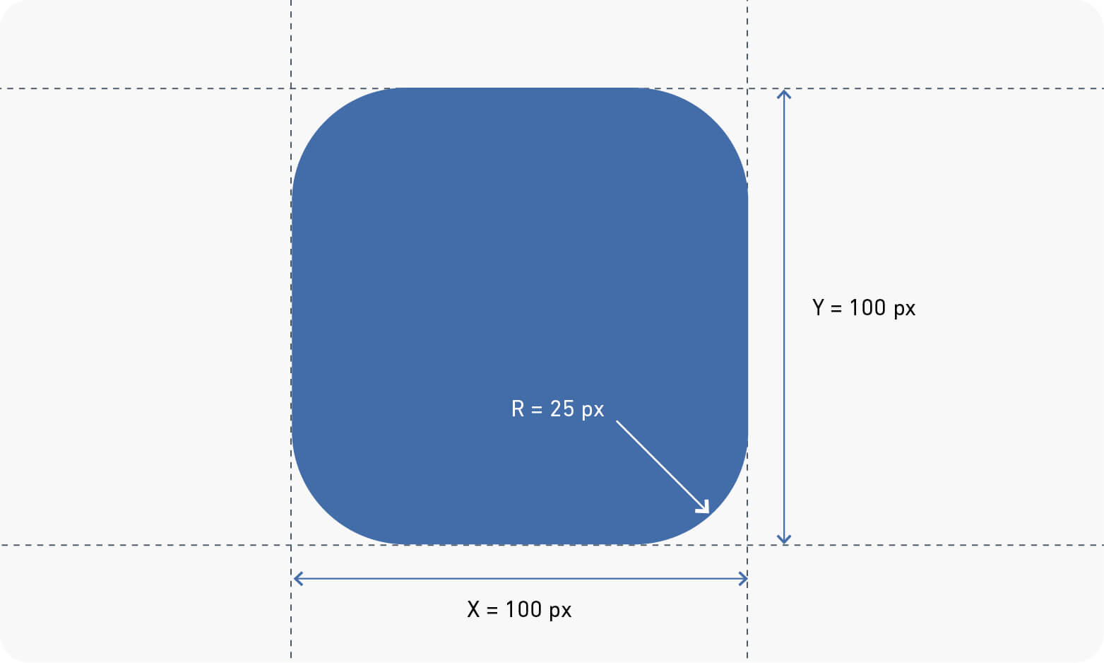
To ensure squircle consistency, we adopt a 1:4 corner radius ratio. Simply divide the side length by 4 to determine the corner radius.
For instance, a 100 x 100 px squircle would have a corner radius of 25 px.
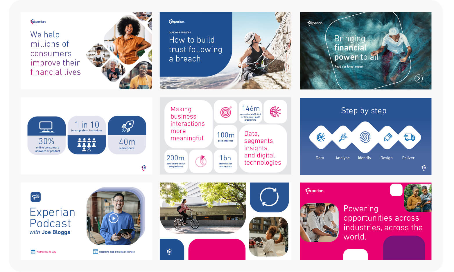
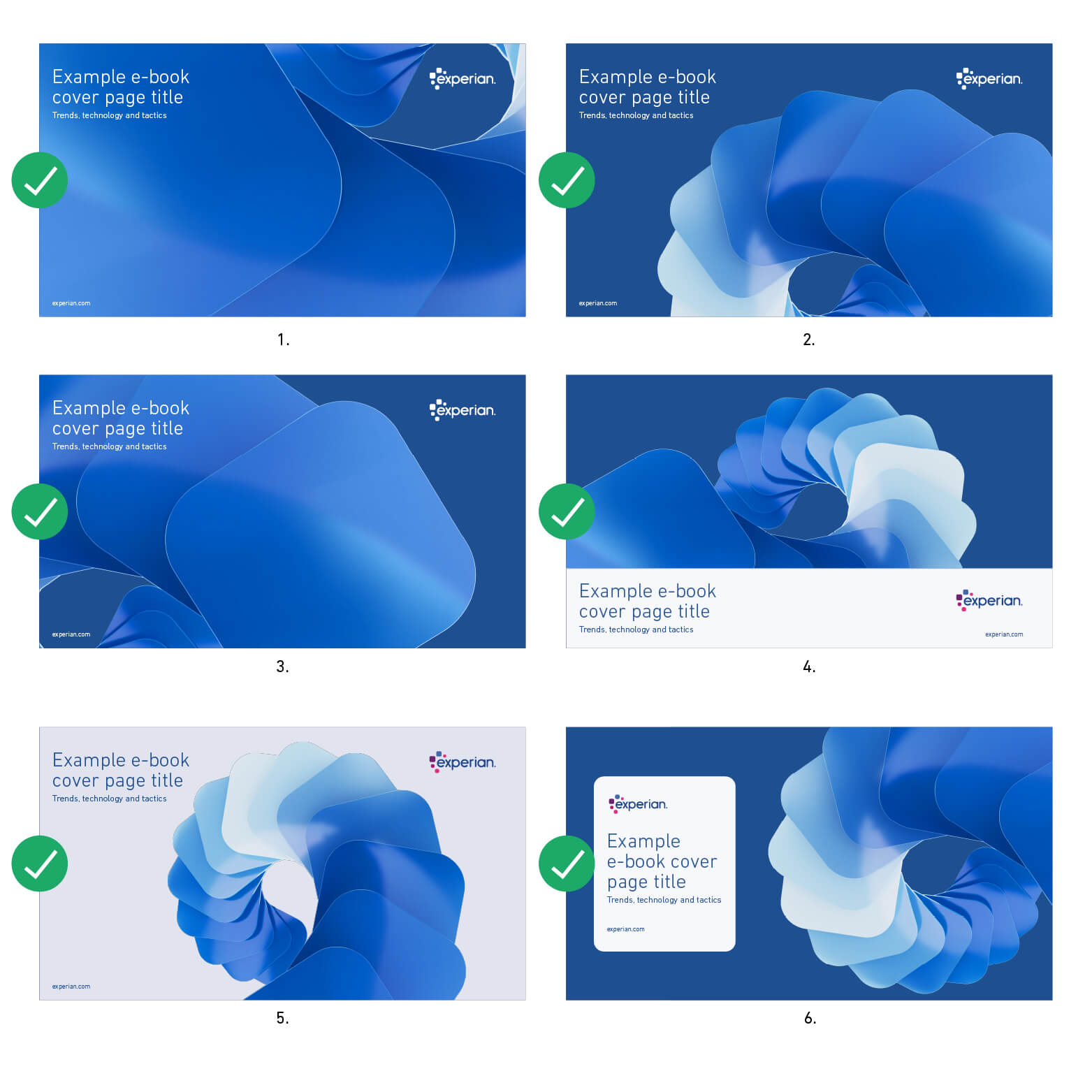
These examples highlight the versatility of squircles in 2D applications.
Squircles function as adaptable containers for text or imagery. They can be rotated and resized to suit the composition, and may extend beyond layout boundaries; introducing a sense of movement and energy to the design.
They can also be used as frames to house content such as headings or iconography, or simply to elevate the visual interest of a layout through their distinctive form.
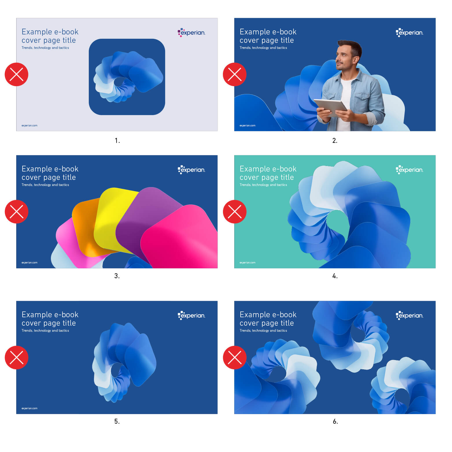
Our distinctive visual identity is built around the squircle and rounded rectangle. To preserve brand clarity and consistency, the use of additional shapes should be avoided.

These assets can be used in place of traditional photography or textured backgrounds, acting as the visual focal point in layouts, marketing materials, presentations, video content, exhibition graphics, and more.
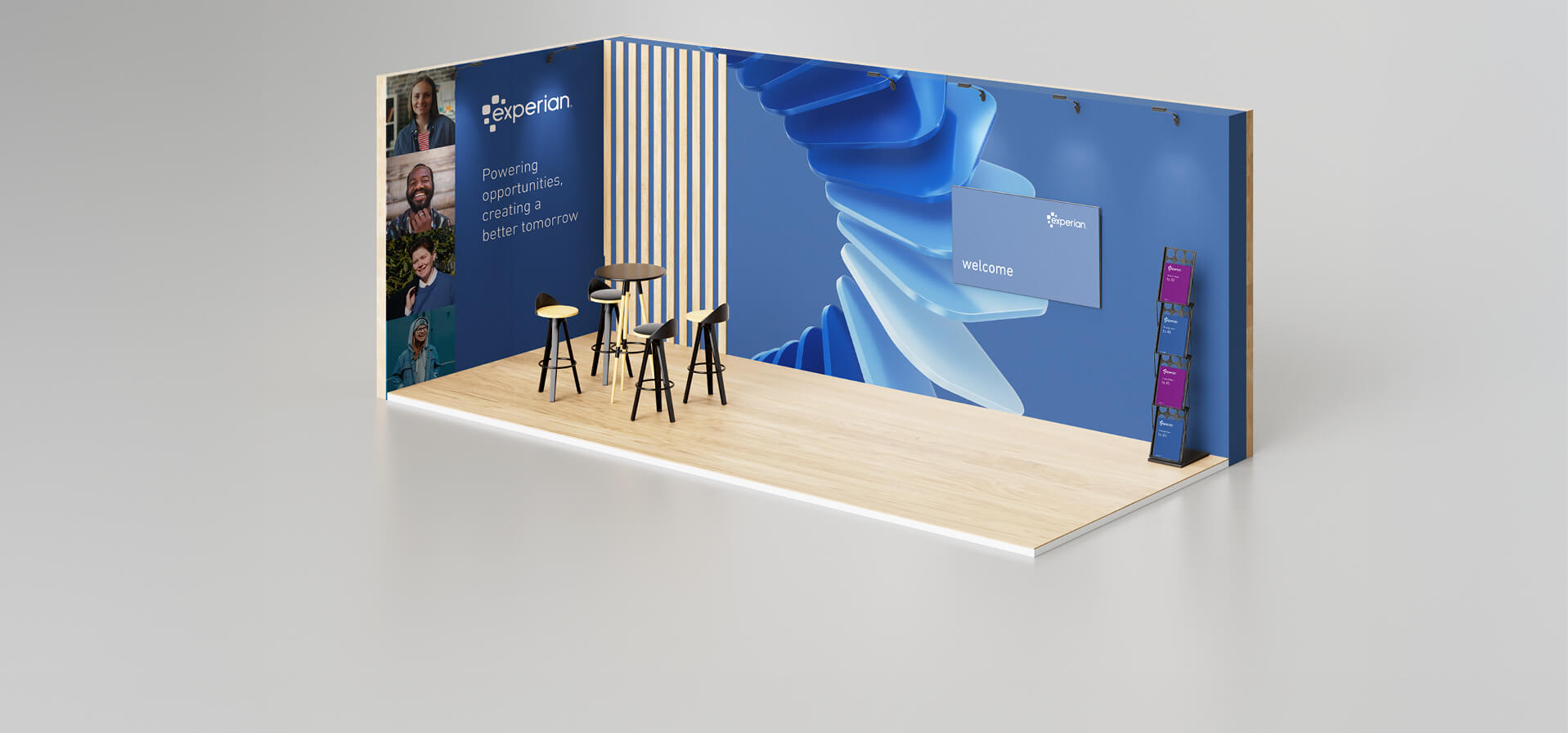
The 3D squircles are hero brand assets, bold and recognisable elements that bring the Experian identity to life. They’re primarily designed for use when representing the brand more broadly or conveying its meaning at a conceptual level, for example, in event stands or large-scale brand expressions. They’re also effective when human imagery isn’t suitable, such as when illustrating more abstract or complex themes like data, decisioning, AI, or innovation.
Use them confidently and with purpose to create impact, ensuring they remain a clear focal point rather than background texture. Avoid overusing them within a layout or applying them decoratively, as this can create visual clutter and reduce their effectiveness as hero assets.
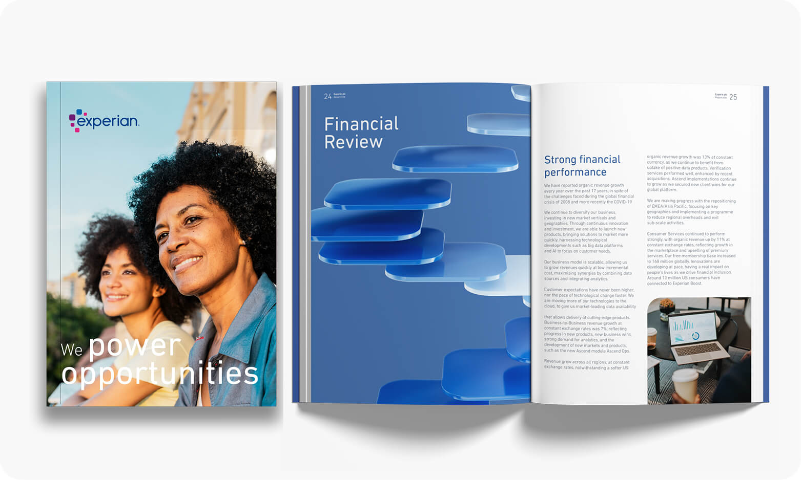
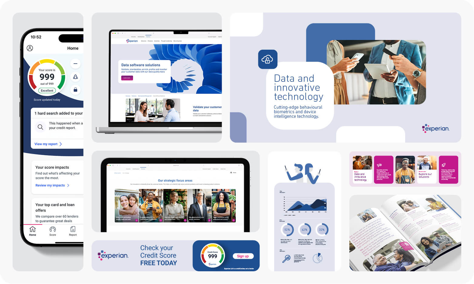
3D squircles and photography each play distinct roles within the Experian visual identity.
Photography should lead when the goal is to connect on a human or emotional level, for example, when communicating stories about people or culture. Authentic imagery helps create relatability and engagement.
3D squircles should be used when the message is more conceptual or abstract, such as illustrating themes related to data, technology, or innovation.
3D squircles do not replace photography. They can be used side by side in the same layout, but never on top of each other. Layering the two creates mismatched texture, lighting, and perspective that contradict our natural photographic style.
Use photography to tell stories and convey emotion, and 3D squircles to represent the brand’s innovative or technological depth.
Want bespoke 3D squircle assets for a particular campaign or event? Contact the Global Brand Team for guidance.
Ask the Brand Team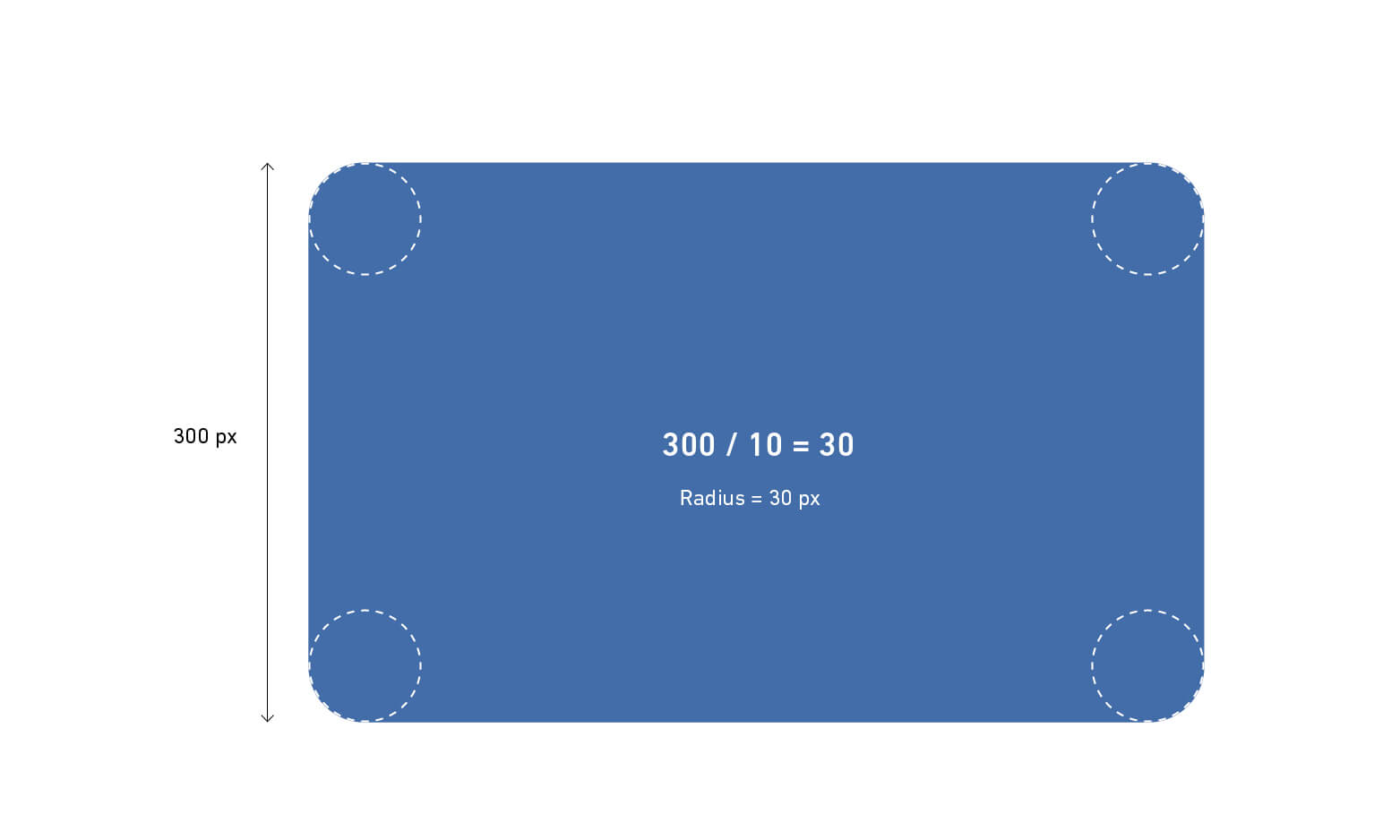
Rounded edges are a core element of the Experian design language, originating from our logo, seen in both the squircles and the wordmark, and echoed throughout our iconography.
Where possible, follow this rule to ensure a cohesive and consistent visual identity across all brand materials.
When using a single rounded rectangle on a layout:
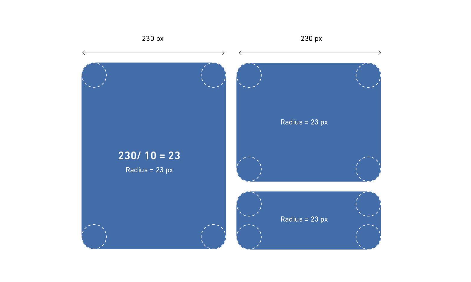
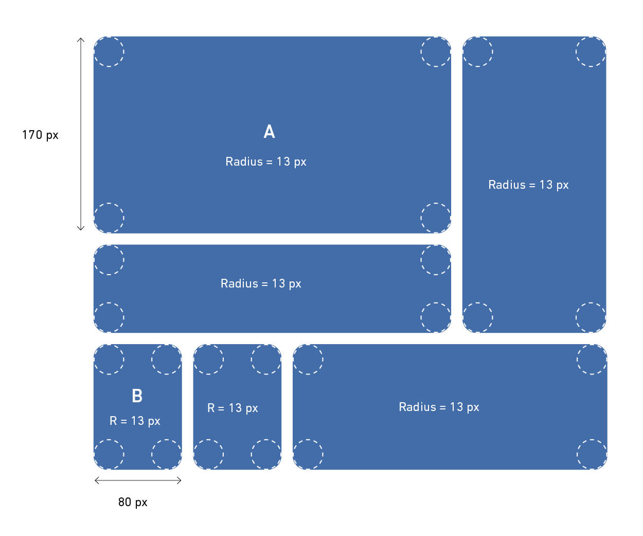
When multiple shapes share the same height or width:
In this example, both shapes have the same shortest side of 230px.
230 ÷ 10 = 23, so the corner radius is 23px.
This approach keeps all shapes looking consistent and unified.
When working with a variety of shapes in a single composition:
In this example:
To find a consistent corner radius: