Brand Mark
Our brand mark is a central part of our identity. It represents who we are and helps create a consistent look across all brand touchpoints. Clear space, sizing, and placement all help keep it strong and recognisable.
Our brand mark is a central part of our identity. It represents who we are and helps create a consistent look across all brand touchpoints. Clear space, sizing, and placement all help keep it strong and recognisable.
You can find a variety of brand marks for both digital and print use on the Brand Asset Hub.
Brand Asset Hub
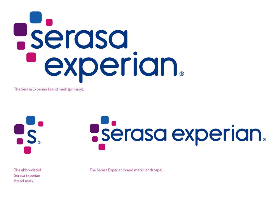
The Experian brand mark consists of two elements:
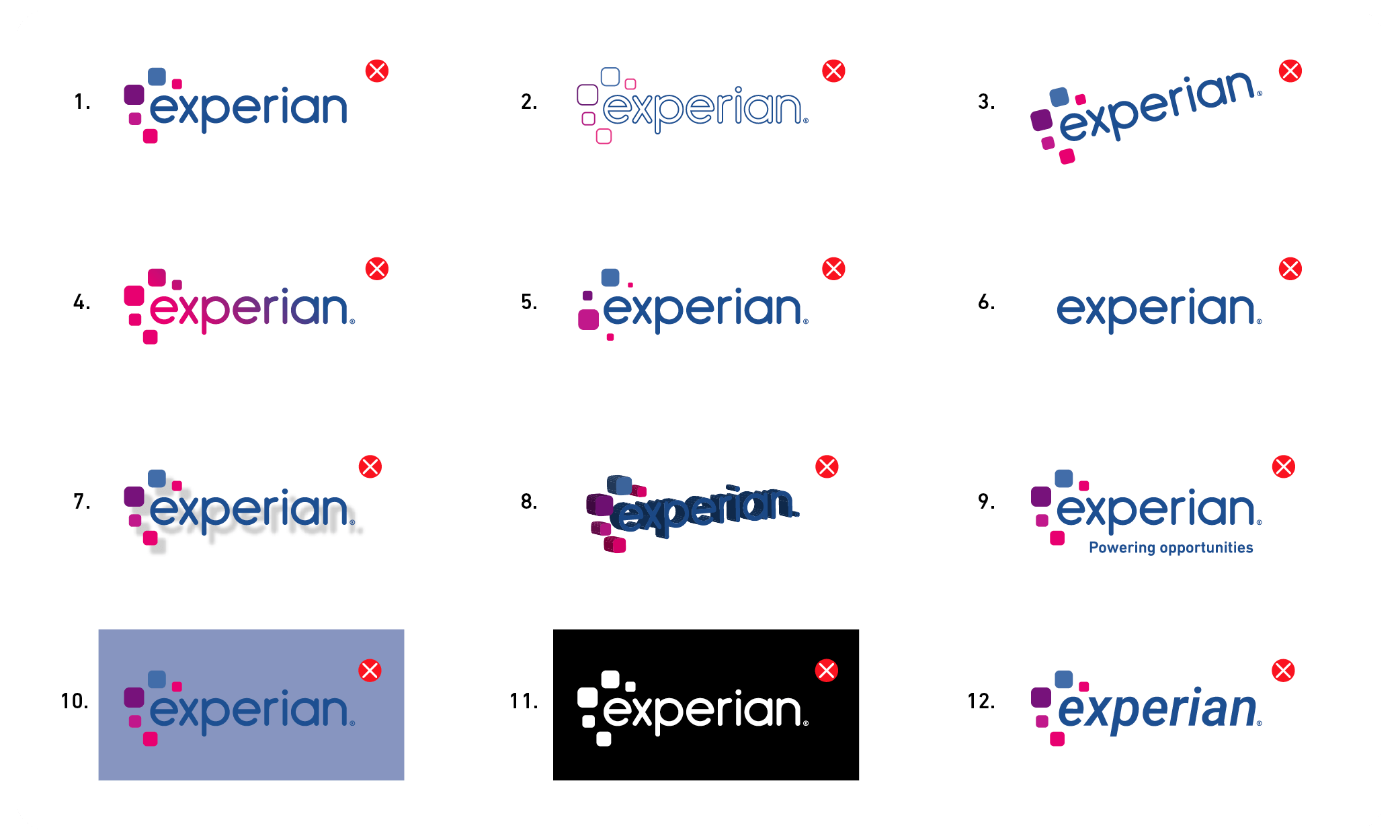
These elements have a fixed size and position, created as master artwork files. Only reproduce our brand mark from these files without alterations.
In limited spaces like digital applications, social media or internal communications, we can use the abbreviated brand mark.
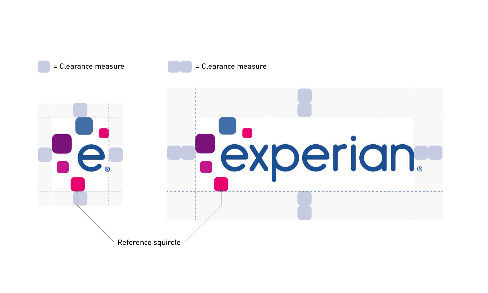
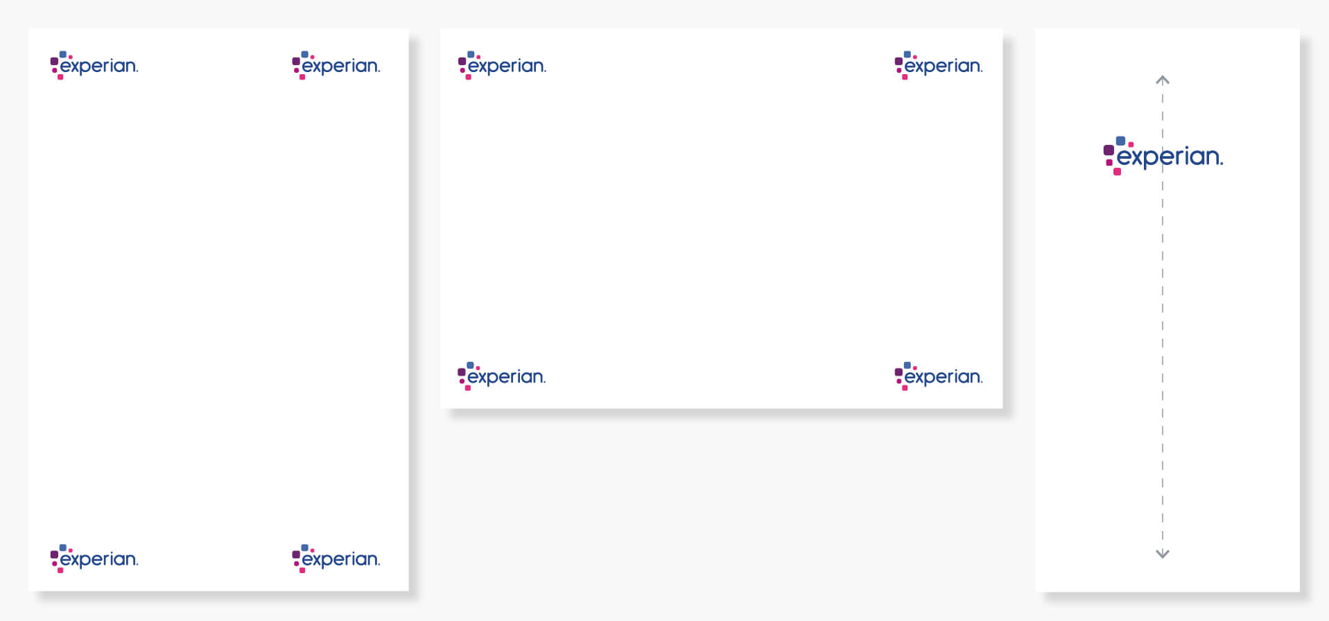
To ensure clarity and legibility, maintain a defined clear space around the Experian brand mark, free of text, graphics, or imagery.
The primary brand mark’s minimum clear space is defined by two magenta squircles. For the abbreviated brand mark, use the smallest squircle. This is especially useful in digital environments.
The clear space does not include the ® symbol. The edges of the squircles and wordmark define the clear space.
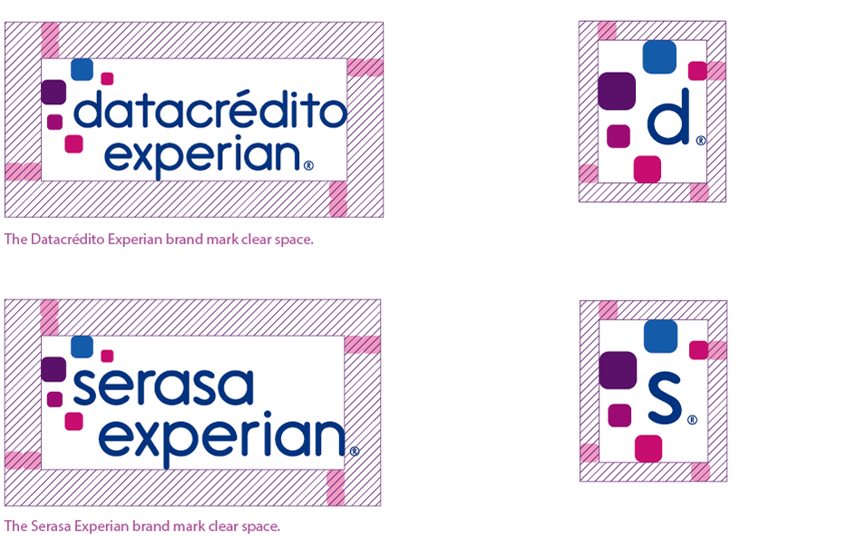
Refer to local market variations for clear space rules for Datacrédito Experian and Serasa Experian brand marks.
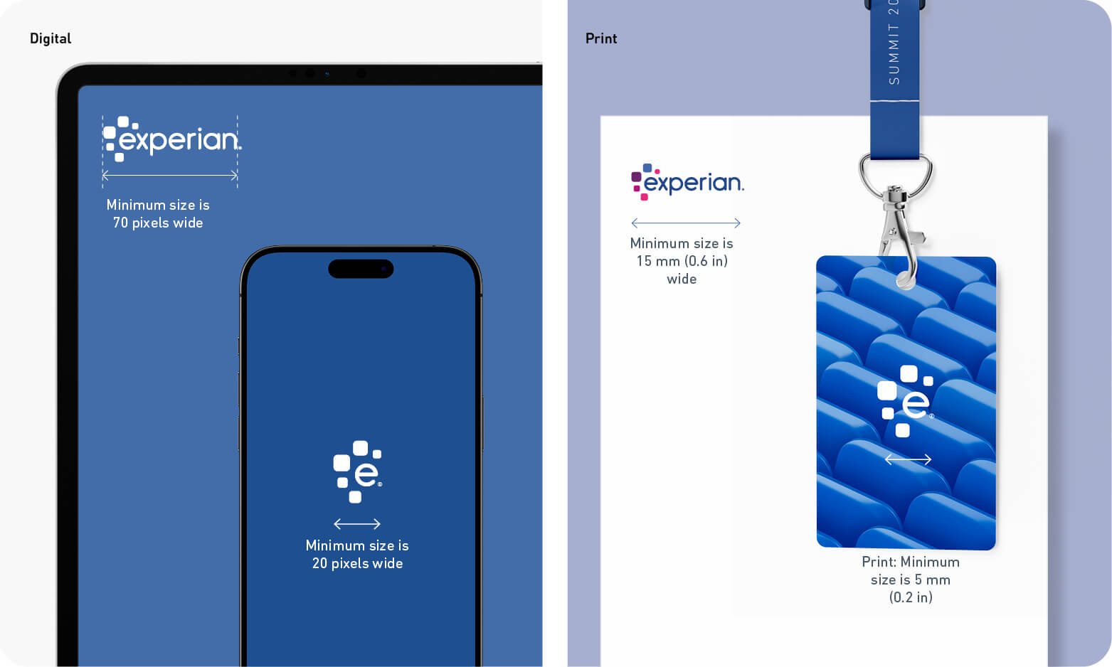
To ensure high-quality reproduction, our brand mark has a defined minimum size, measured across its width (excluding the ® symbol).
For restricted spaces, such as digital applications, use the abbreviated brand mark (same for local market varients):
Stacked Datacrédito Experian and Serasa Experian logos:

When placing a logo on a photograph, ensure you place it in an area clear of clutter. Use the full colour logo on lighter parts of the image only to ensure legibility.

Place the white logo on darker areas of the image and avoid busy sections to ensure it remains visible.
Placement is determined by the design layout. For maximum visibility, position the brand mark in a top corner. When our logo needs to be prominently displayed it can be centred to become a focal point.
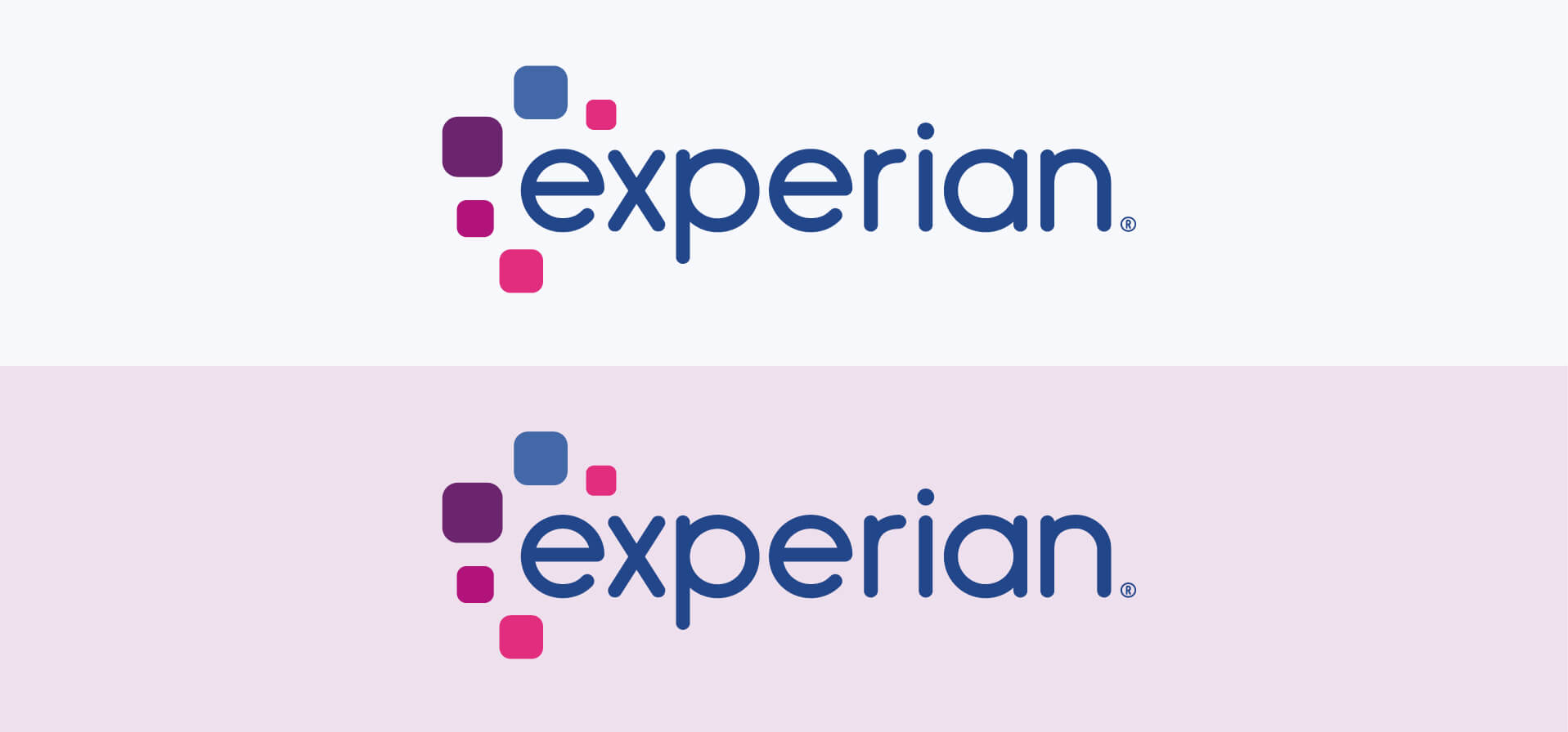
Use the full colour logo on white and light backgrounds such as the 10-20 Support palette tones. Never use the logo on tones darker than 20.
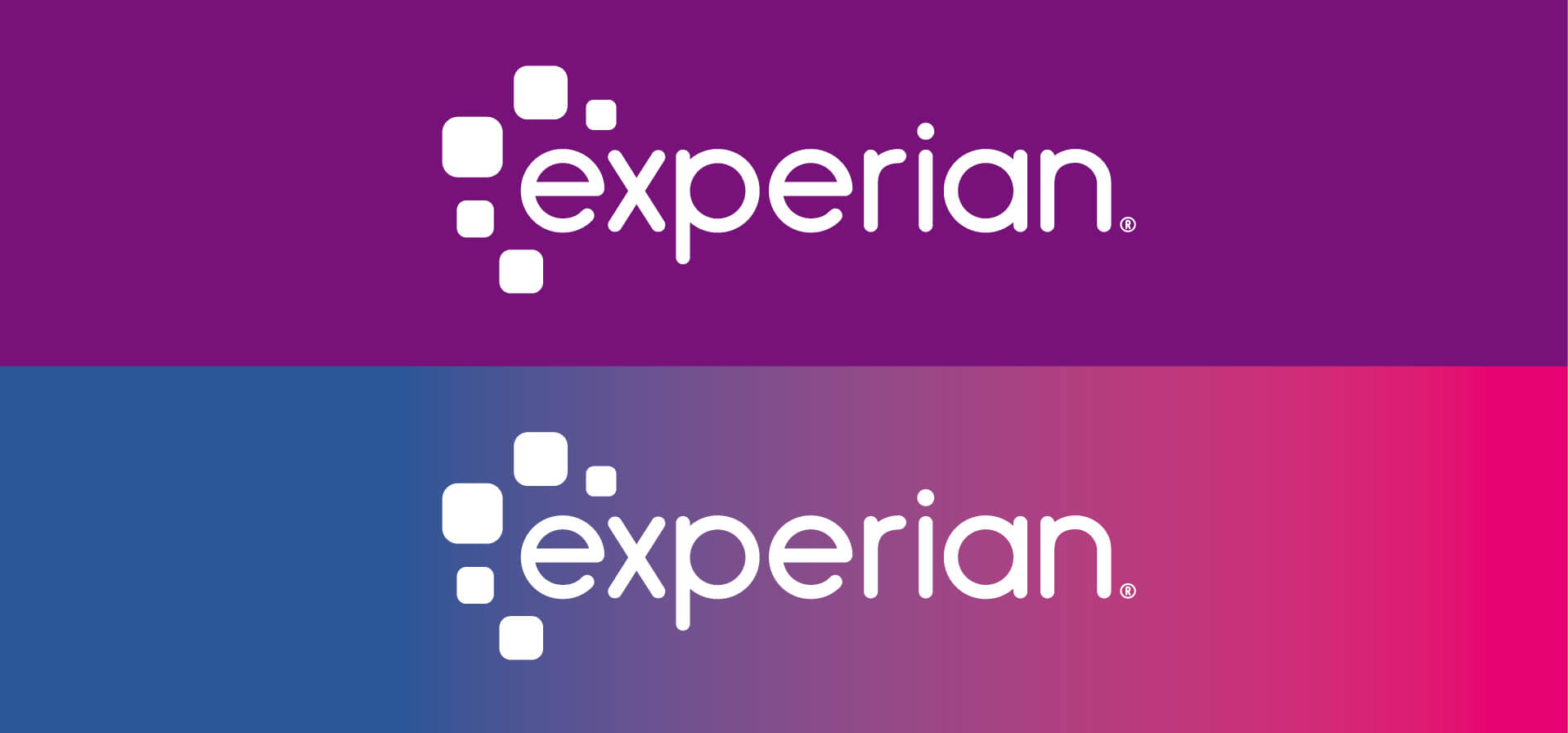
Use the white logo on darker backgrounds such as Primary palette colours, gradients or 30-50 Support palette tones.
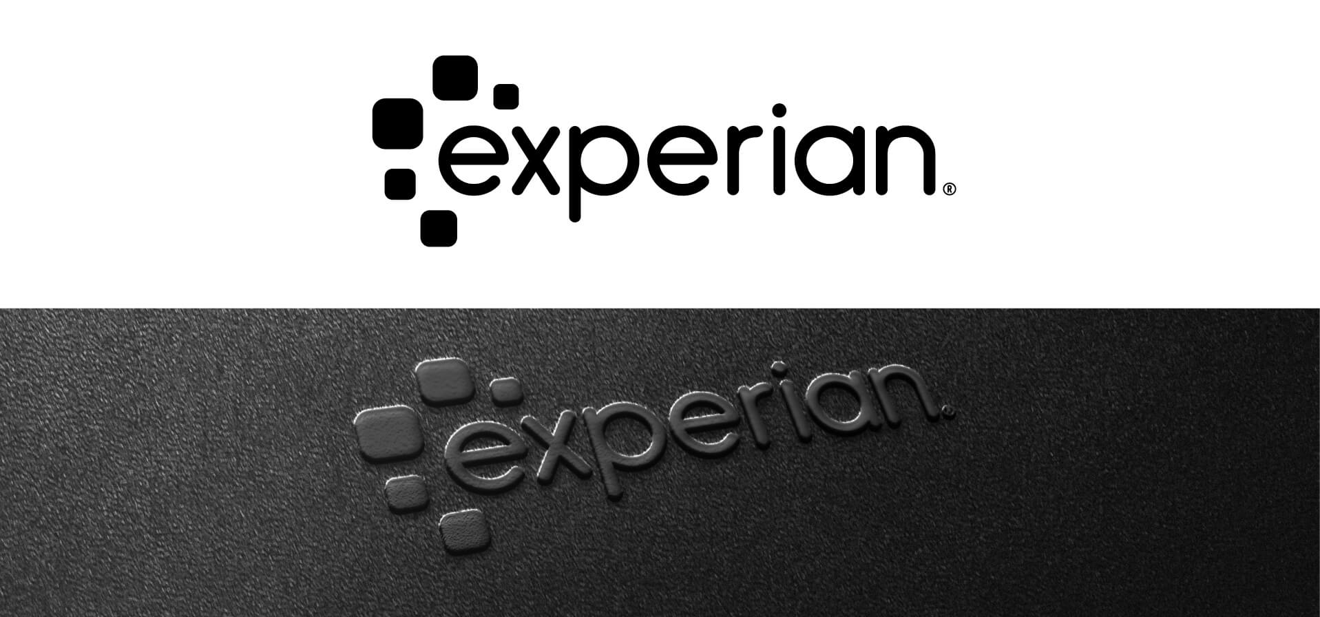
Only use the black logo when full-colour production isn’t possible, e.g., embossing or black and white printing.

Animated elements are essential in video productions, typically appearing as intros or outros. They ensure every film, advert, and animation is unmistakably branded as Experian, creating ownership and consistency.
Professional production companies may create their own start or end frames but must retain the brand look. Avoid effects like 3D extrusions or lens flares.

Designed for limited spaces to maximise impact.
All animation files are available on the Experian Brand Asset Hub.
The below Datacrédito Experian brand mark variation is specific to our Colombian market.
Artwork is available for these variations on the Brand Asset Hub; stacked and landscape versions, plus an abbreviated version for online situations when there is limited space.
Note: Never recreate or mix any of the elements.

The same clear space principles as outlined in the previous section also apply to the Datacrédito Experian and the Serasa Experian brand marks.
An area of clear space has been defined that should remain free of any elements such as text, graphics or imagery.
The minimum clear space of the primary brand marks is defined by the two magenta squircles as shown.
The minimum clear space of the abbreviated brand marks are defined by the smallest squircle. This is useful, especially within the digital environment.
The clear space shown is only a minimum and can be increased if necessary.
Note: The clear space does not take the ® symbol into consideration. The edges of the squircles and the wordmark define the clear space.
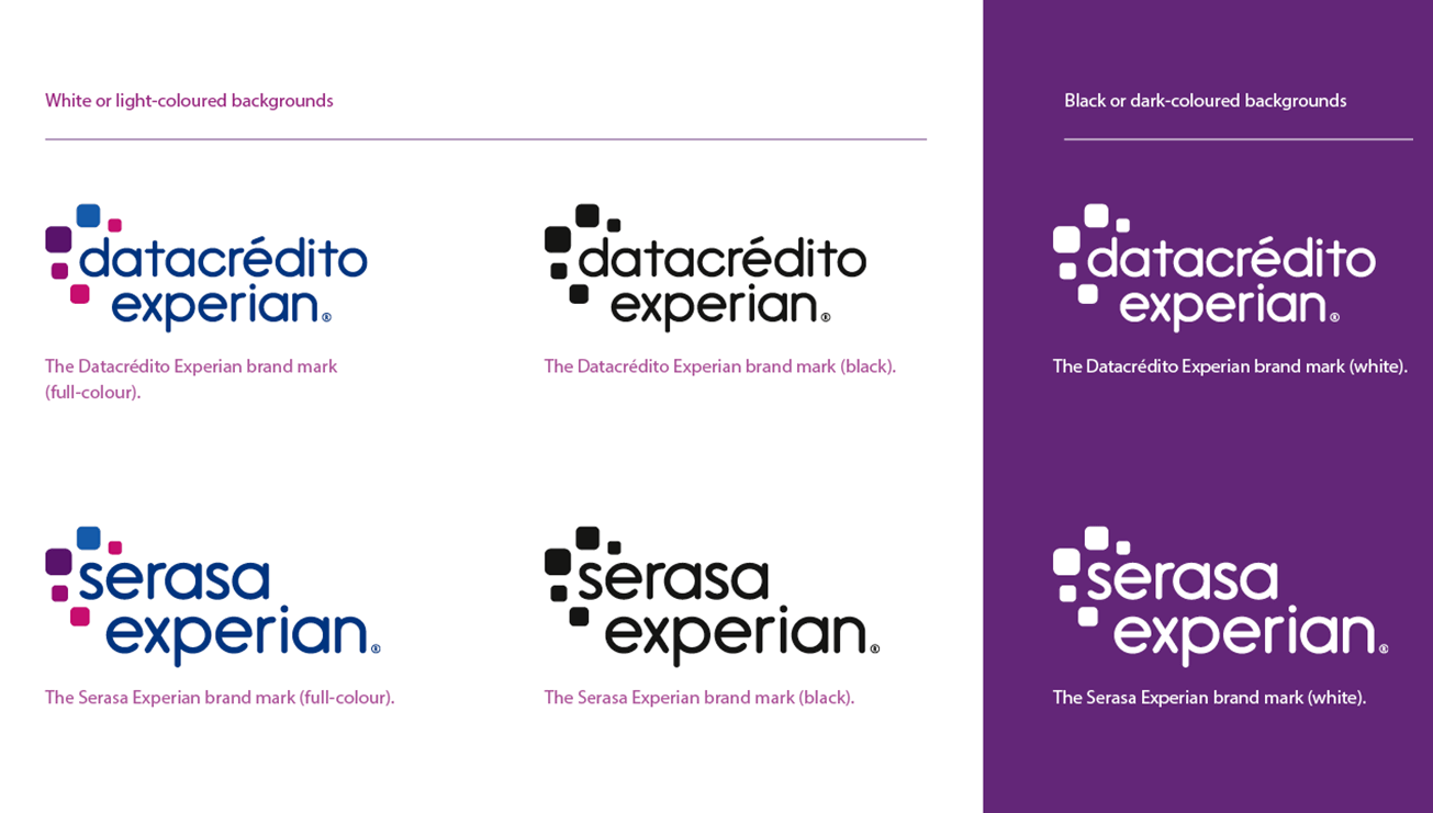
The same colour principles as outlined in the prior colourways section also apply to the Datacrédito Experian and the Serasa Experian brand marks.
These brand marks can be used in the following three colourways:
A white or light-coloured background is defined as the tonal equivalent of a 0%–20% tint of black. A darker-coloured background is defined as the tonal equivalent of a 20%–100% tint of black.
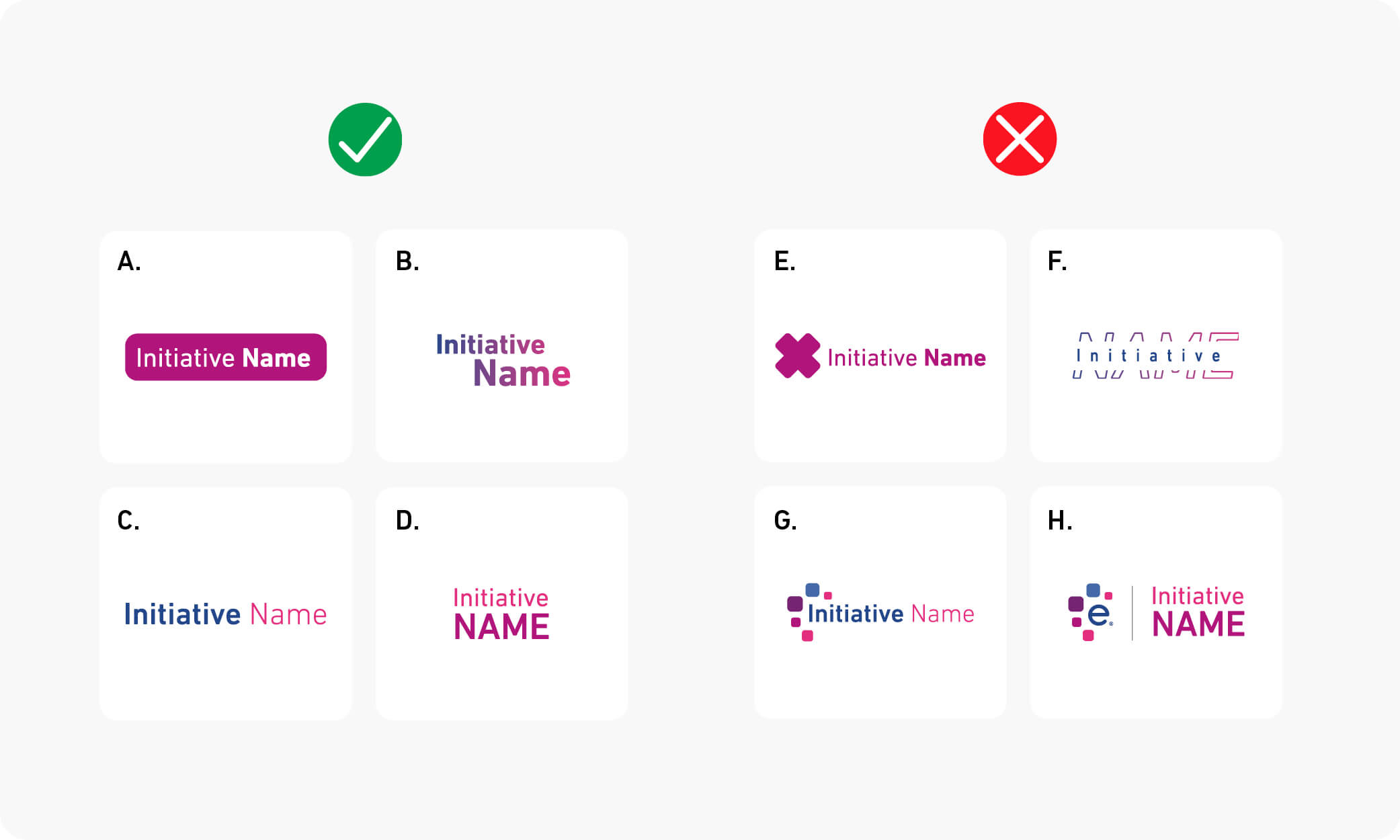
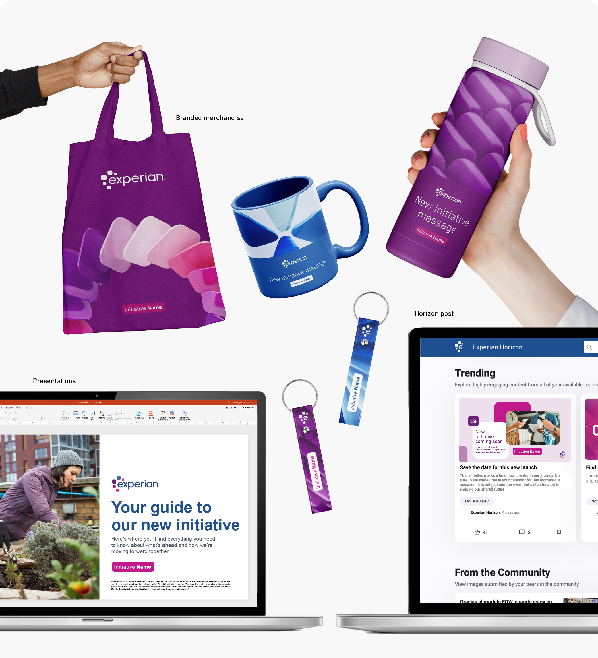
We use one Experian brand across everything we do — every product, service and initiative.
This unified approach helps people recognise us instantly and strengthens the trust we’ve built over time. It also keeps our communications clear and consistent, without extra logos competing for attention.
Across Experian, different teams and initiatives have their own focus and audiences. To show those differences while staying part of one brand, we use typographic identifiers, not new logos.
Most of the time, you won’t need a new identifier. But if you do, follow this guide to make sure it fits our brand principles and keeps our identity strong and connected, now and in the future.
Here are some permitted examples
A. Using a rounded corner rectangle or squircle to frame the wordmark
B. Using different size fonts sizes and placements
C. Using colour and font weights
D. Switching between lower and uppercase lettering
Here are some examples that are not permitted
E. Including a logomark or icon next to the workmark
F. Modifying the typeface, impacting the legibility
G. Using the squircles or shapes in combination with the wordmark
H. Locking it up with the Experian logo